Tarot card title design, numbering, and borders
Tarot card title design is the layer that makes a card readable at a glance: a legible name, a clear number, and a border that survives the printer's cut. Get it wrong and titles clip against the edge, numbers crowd the art, and thin borders come out crooked on cards you spent years painting.
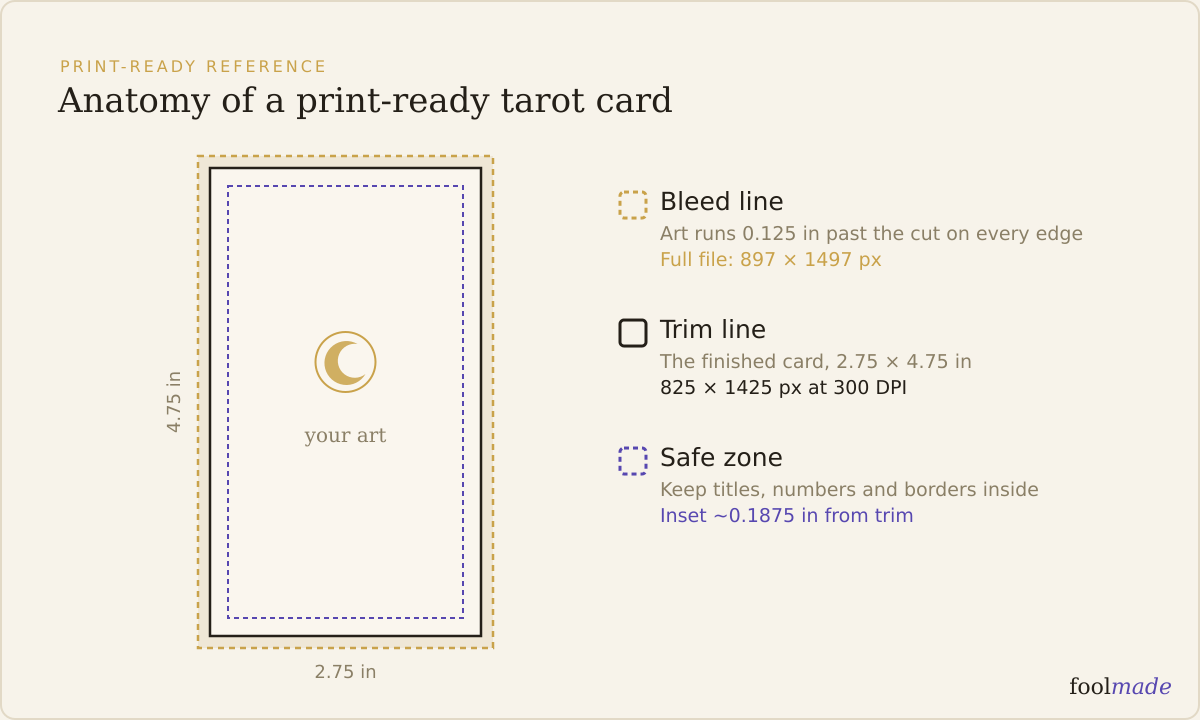
The art is yours. The title, number, and frame are the plumbing that carries it onto a printed card. Here is how to build that layer so it reads the same on all 78 cards.
What makes tarot card title design legible?
A title is legible when a reader can name the card across a table without leaning in. That comes down to four things: font, size, a place to sit, and contrast against whatever is behind it.
Pick a font with real weight and open letterforms. A thin script looks elegant on screen and vanishes at print size, especially over busy art. If you love a decorative face, pair it with a plain, sturdy backup for the actual card name and keep the flourish for the deck logo.
Size it for the physical card, not the zoomed-in canvas. A standard tarot card is 2.75 by 4.75 inches, so a title set around 14 to 20 points reads cleanly, and a card number can go smaller at 10 to 14 points. Set your file to 300 DPI first, then judge type at 100 percent zoom so you see true size.
The reliable fix for legibility over painted art is a title band: a solid or semi-solid strip behind the text. It gives the letters a consistent background so the title does not fight a dark passage on one card and a pale sky on the next. A band also keeps the whole deck feeling uniform, since every card names itself the same way.
If you would rather not band every card, buy contrast another way. Dark text on light art, light text on dark art, or a thin outline or drop shadow to lift letters off the background. The one rule: check the worst card, not the easiest one.
Roman or arabic, and where does the number go?
Most traditional tarot decks number the Major Arcana in Roman numerals, from 0 or the unnumbered Fool through XXI, The World. Readers of Rider-Waite-Smith style decks expect Roman, so if you are following that lineage, Roman numerals signal that you know the tradition.
Arabic numerals are fine, and they are easier to read at a glance, especially past X. Plenty of modern and oracle-leaning decks use them. The honest tradeoff: Roman looks classic and can slow a reader down at XVIII; arabic is instantly clear but reads more contemporary. Pick one and use it on every card, majors and pips alike.
Placement matters as much as the numeral. Top-center and top-corners are the common homes for a number, with the title along the bottom. Keep the number and title on opposite ends so neither crowds the other, and keep both well inside the trim.
Watch the Minor Arcana. Pips and courts need the same numbering logic as the majors, or the deck feels stitched together. Decide early whether courts get numbers or just names, because retrofitting 56 cards later is the kind of job that stalls a deck.
How does tarot card title design keep borders from breaking at the cut?
A border survives the cut when a small trim shift does not make it look wrong. Printers cut with a tolerance, often plus or minus a millimeter or two, so a border that sits perfectly centered in your file can print thicker on one side of the physical card.
The thin-border trap is the classic mistake. A crisp 1mm frame hugging the trim line looks sharp on screen and comes out visibly lopsided once the blade drifts, because a half-millimeter shift is a big fraction of a 1mm line. On a full deck that unevenness repeats across every card and reads as sloppy printing, even when the printer did nothing wrong.
Use a thick border instead, or no hard frame at all. A border 3mm or wider absorbs the same trim shift without the eye catching it, because the drift is a small fraction of a fat line. If you want a delicate look, float the fine line inward, away from the edge, so trim tolerance never touches it.
Borders can leak orientation too, the same problem that governs the card back design. If your frame has a decorated top and a plain bottom, a reader can tell a reversed card from the border before flipping it. If reversals matter to your buyers, keep the border symmetric top to bottom.
How does this tie to bleed and the safe zone?
Every title, number, and border lives inside a three-part layout: bleed, trim, and safe zone. Getting the title layer right means respecting all three.
Bleed is the extra art past the trim line that gets sliced off, usually an eighth of an inch (about 3mm) per side, so no white edge shows if the cut drifts. Your background and any border color that touches the edge must run all the way into the bleed. The full setup is in what bleed is and how much your deck needs.
The safe zone is the inner margin, roughly 3mm inside the trim, where nothing important can be cut off. Titles, numbers, and any thin border line belong entirely inside it. Anything closer to the edge is gambling on a perfect cut you will not always get. Exact dimensions in inches, millimeters, and pixels are in the tarot card size and dimensions guide.
Here is the title layer as a quick reference:
| Element | Good practice | Trap to avoid |
|---|---|---|
| Title font | Sturdy, open letterforms with weight | Thin script that vanishes at 2.75 inches |
| Title size | 14 to 20pt, judged at 100 percent, 300 DPI | Sizing type on a zoomed-in canvas |
| Contrast | Title band or clear dark-on-light split | Text laid straight over busy, variable art |
| Numerals | One system (Roman or arabic) on all cards | Mixing Roman majors with arabic pips |
| Number placement | Top-center or corner, inside the safe zone | Number crowding the title or hugging the edge |
| Border thickness | 3mm or wider, or no hard frame | 1mm line on the trim that trims lopsided |
| Border symmetry | Top-bottom symmetric if reversals are used | Decorated top that leaks card orientation |
| Edge color | Border and background bleed past the trim | Frame stopping at the trim, risking a white sliver |
Frequently asked questions
Should tarot cards use Roman or arabic numerals?
Roman numerals are the tradition for the Major Arcana and signal a Rider-Waite-Smith lineage, which many readers expect. Arabic numerals are easier to read at a glance and suit modern or oracle-style decks. Either works; use one system consistently across all 78 cards.
How big should a tarot card title be?
Set the title around 14 to 20 points and the card number around 10 to 14 points on a standard 2.75 by 4.75 inch card at 300 DPI. Always judge the type at 100 percent zoom, because text that looks fine on a zoomed-in canvas often reads too small on the physical card.
Do I need a title band on every card?
You need consistent contrast, and a title band is the easiest way to guarantee it across 78 cards with different art behind the text. If your art has reliable dark or light zones where the title sits, an outline or drop shadow can replace the band. Test your busiest card, not your cleanest.
How thick should a tarot card border be?
Aim for 3mm or wider, or skip a hard frame entirely. Trim tolerance of a millimeter or two makes a thin 1mm border print visibly off-center, while a thicker border absorbs the same shift invisibly. Keep any fine border line inside the safe zone, away from the cut.
Will a thin border look uneven after printing?
Often, yes. Because printers cut with a small tolerance, a thin border hugging the trim line can come out thicker on one side of the card. The fix is a wider border, or floating a fine line inward so trim drift never reaches it.
The bottom line: treat the title, the number, and the border as a system that has to read the same on every card and survive an imperfect cut. Build the title band for contrast, pick one numeral system, keep borders thick or absent, and hold everything inside the safe zone. Before you commit to a run, the print-ready checklist walks the full pre-flight, and Foolmade's print check flags titles, numbers, and borders sitting too close to the trim so nothing legible gets cut.