Designing your tarot card back (and reversals)
Good tarot card back design comes down to one constraint the front never has: the same image prints on all 78 cards, and it should read the same upside down as right side up. If a reader uses reversals, an asymmetric back tells them which way a card is facing before they flip it. That breaks the reading.
That is the whole problem. Everything below is how to solve it without making a boring back.
Why does the card back have to be reversible?
Many readers pull cards face down, then turn them over top to bottom. If your back has an obvious top and bottom, the reader can see the card's orientation while it is still face down. A crescent that points up when the card is upright will point down when the card is reversed, and now the surprise is gone.
Reversals are a real part of how a lot of people read. A back that leaks orientation makes your deck feel amateur to exactly the buyers who read most seriously, and it is the kind of flaw that shows up in reviews.
So the design job is not just "make a pretty back." It is "make a pretty back that hides orientation." Those two goals fight each other, and the craft of a good back is resolving that fight.
What makes a card back reversible?
A back is reversible when nothing in it reveals which end is up. The reliable way to get there is rotational symmetry: the image looks identical when you spin it 180 degrees around the center of the card.
Two-fold rotational symmetry is the gold standard. Think of a design where the top half is the bottom half rotated, not just mirrored. A classic example is a central medallion with an identical motif radiating to all four corners. Spin the card and nothing moves.
There are three broad approaches, and they are not equally safe:
| Approach | Reversal-safe? | Best for |
|---|---|---|
| Fully symmetric (180-degree rotational or four-fold) | Yes, always | Any deck where readers use reversals |
| Near-symmetric (symmetric layout, tiny off-center detail) | Risky, often readable up close | Decks where you want subtle life in the pattern and accept some risk |
| Directional (a scene, a figure, text with a clear top) | No | Decks sold as upright-only, or personal decks |
If you are not sure how your buyers read, design the back fully symmetric. It costs you nothing and it never bites you later.
How do I keep the back simple enough to work?
Busy backs hide wear well, but they also hide symmetry mistakes, which is where makers get caught. Start from a simple geometric skeleton and build outward from the center.
Patterns that behave under 180-degree rotation:
- A centered medallion, seal, or mandala with even spokes.
- An all-over repeating pattern (stars, dots, a lattice) with no edge that anchors a top.
- A four-corner motif where each corner is identical.
- Concentric rings or a border frame with the same treatment on every side.
Things that quietly break symmetry: a single moon phase, one initial or signature, a horizon line, a figure, any lettering, a light source that falls from one direction. Even a gradient from dark-top to light-bottom is directional. Watch shadows most of all, because a drop shadow gives every element an up.
Two colors and one strong motif almost always beat a crowded illustration on a back. The front carries the art. The back carries the deck's identity in a single repeatable mark.
How do borders and bleed work on the back?
The back needs the same bleed and safe-zone treatment as every front card, and it needs it to be even on all four sides, or the symmetry you designed will not survive the cut.
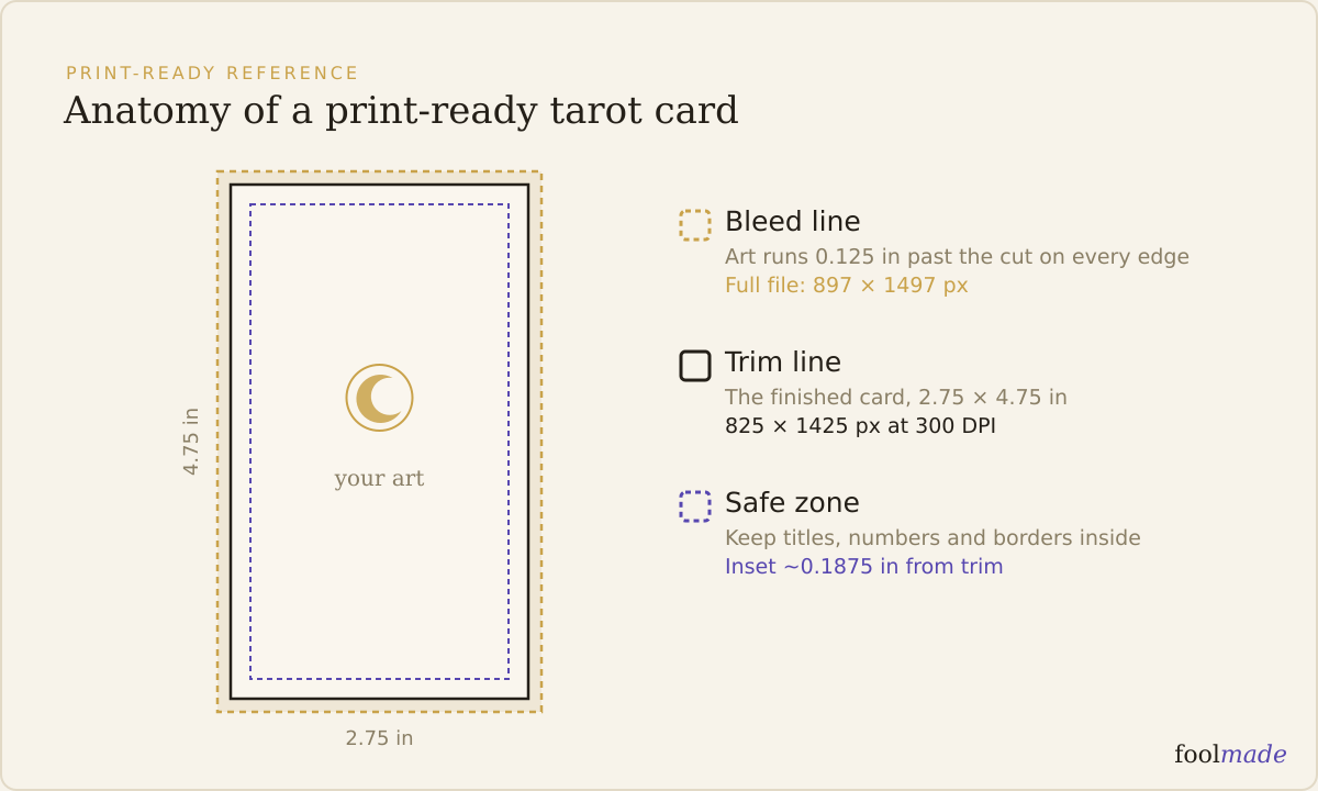
Bleed is the extra image area past the trim line that gets sliced off, so no white edge shows if the cut drifts. Printers usually want an eighth of an inch (about 3mm) of bleed on each side. Your background must run all the way to the bleed edge. See what bleed is and how much your deck needs for the full setup.
The danger with a symmetric back is the trim. Cutting has a tolerance, often plus or minus a millimeter or two, so a thin border that looks perfectly centered in your file can come out thicker on one side of the printed card. On a symmetric design that off-center border reads as a top or bottom marker, undoing your work.
The fix: avoid thin borders hugging the trim on a back. Use a thick border, or no visible border, or a pattern that runs off all four edges so there is no single frame line to sit crooked. Keep every important element inside the safe zone, well away from the trim. The exact dimensions live in the tarot card size and dimensions guide.
How do I test a card back before I print?
You test a back by trying to break its symmetry, then by seeing it in a real proof. Both steps catch different failures.
The digital test takes two minutes. Duplicate your back file, rotate the copy 180 degrees, and lay it over the original at 50 percent opacity. If anything fails to line up, that misalignment is exactly what a reader will spot.
Print one page at home, cut a card to size, and hold it against a bright light. This shows two things: whether the back is opaque enough that a strong image does not ghost through (black-core stock fixes this), and whether the pattern still reads as orientation-neutral in your hand rather than on screen.
Then order a real proof from your printer before the full run. A proof shows the true trim, the real color, and how your border actually landed after cutting. It is the only way to catch a crooked frame before it multiplies across a thousand decks. The print-ready checklist covers the full pre-flight, and reading up on the 78-card anatomy is a good reminder that this one file rides on every card you painted.
When you want to see the back on a finished object before spending on a proof, Foolmade's deck mockups drop your back and front art onto a rendered card and box so you can judge the whole deck as a physical thing, not a flat file.
Frequently asked questions
Does a tarot card back need to be symmetrical?
Only if your readers use reversals, but most indie buyers do, so treat symmetry as the default. A 180-degree rotationally symmetric back reads the same either way and never reveals a card's orientation while it is face down.
Can every card in the deck use the same back?
Yes, and it should. One shared back prints on all 78 cards, which keeps the deck feeling like a cohesive object and keeps your print file simple. A unique back per card is unusual, more expensive to set up, and would let a reader identify cards from behind.
What is the best color for a tarot card back?
Deep, saturated darks like navy, black, or a rich jewel tone hide handling wear and edge dirt far better than pale backs, which show every fingerprint. Pair one dark ground with a single metallic or light accent for a back that stays clean-looking through years of shuffling.
How do I stop the front art showing through the back?
Print on black-core cardstock. The black layer in the middle of the card blocks light so a bold front image does not ghost through to the back. Thin white-core stock is the usual culprit when a dark painting shadows through.
Can I put my logo or signature on the card back?
Keep it off, or place it so symmetry survives. A single signature in one corner is directional and breaks reversal-neutrality. If you want a maker's mark, repeat it in all four corners or center it in a rotationally symmetric emblem.
The bottom line: design the back to disappear. A reader should feel the deck, not read its orientation off the back. Get the symmetry right, keep the border thick or absent, and prove it with a rotated overlay and a real proof before the run.
- The Tarot de Parisbacks, indexes and other bookkeeping
- The Jean Noblet Tarotthe chevron back and its descendants
- The Jean Dodal Tarotwhat the back was for
- The Besançon Tarotbacks, and what they signal